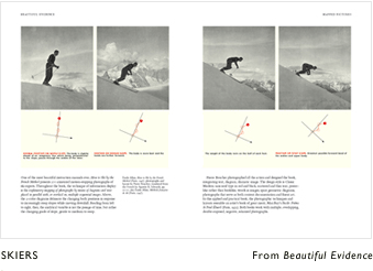
Being the end of the tax year, I ordered a full set of the books by Edward R Tufte last week. I've owned The Visual Display of Quantitative Information before, but it went walkabout somewhere. Now I have the full set again, including his latest.
If you're wondering what the hell I'm talking about, Tufte is the guru of information display. His books are beautiful, inspirational works of art that also come in handy day-to-day. I'd recommend anyone who has to present complex information at least flip through these books. Developers in particular could learn a lot from these books, and the thought processes they kick into action.
One of Tufte's ideas, Sparklines, a method of graphically displaying time-series data in an incredibly small space. This method has been cropping up in more and more places. The following example is from Google Analytics, plotting data about visitors to my web site. (Yes, I won't be retiring to live off my site just yet.)

So I'm rather looking forward to getting to know Tufte's ideas again. Quite exciting!

